That’s right – a big change is coming to LinkedIn profiles with its new desktop redesign! LinkedIn is hoping to increase member usage with this clean, centered and condensed design borrowed from the LinkedIn mobile application.In fact, the primary menus are nearly identical.
Here’s a quick look at some of the changes when viewing profiles. For those using the LinkedIn mobile app, it may look familiar.
Profile Header
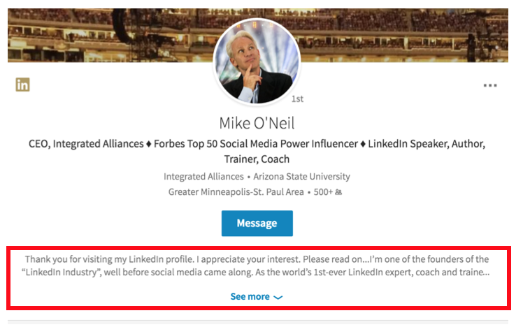
Everything is centered which makes it easier to scan. Contact and Personal Info moved to the right side. Previous employment and industry are gone.
A particularly big change is that your summary is now included in the profile header and it no longer says ‘Summary”. Only the first few sentences will be displayed and people will need to click “See more” to read your entire summary.
Posts & Activities
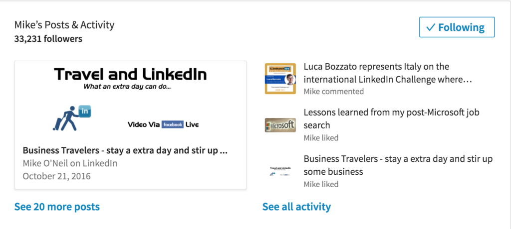
The section immediately under the profile header is posts and activities. It shows your most recent post and which posts you commented or liked. LinkedIn makes it easy for people to follow you by prominently displaying a Follow button.
Sections Being Condensed
To simplify the profile look, the redesign is condensing several LinkedIn sections.
EXPERIENCE SECTION
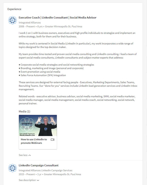
Five positions are displayed. You can list more but people need to click “see more” to view those positions. Also only the description for your first entry is fully displayed. For all your other experience descriptions, people will need to click “see description”.
EDUCATION SECTION
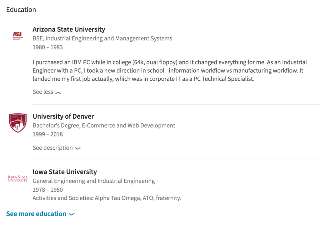
Three educational experiences are displayed on the profile. People need to click “see more” to view any additional degrees. As in the Experience section, only the description for your first entry will be fully displayed. For other descriptions, people need to click “see description”.
VOLUNTEERING EXPERIENCE AND CAUSES
Continuing the the new condensed style, three volunteer experiences are displayed. Again, people need to click “see more” to view those experiences and only the description for your first entry will be fully displayed. For the other descriptions, people will need to click “see description”.
FEATURED SKILLS & ENDORSEMENTS
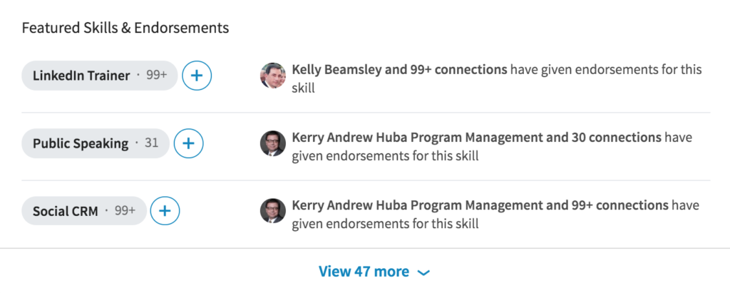
Your top 3 skills are displayed instead of 10. The rest reside under View more. Also gone are the long line of photos of those who endorsed you for that skill. As you see below, LinkedIn will list one person and the number of other connections who endorsed you for that skill.
RECOMMENDATIONS
A couple changes here. First, only 2 recommendations are displayed. The rest can be read by clicking View more. Second, it also appears LinkedIn listened to its users and broke the restriction that a recommendation is tied to a work experience. This enables people to make and receive recommendations including volunteer or industry association relationships.
So What Do You Think?
By condensing, the LinkedIn redesign provides a simpler, cleaner profile view. But at what cost? I fear many will not take the time to click to view additional, valuable text.
I am also disappointed with the location of the summary section and the need to click to read the entire text. The summary gives readers a quick overview of who you are and what you are doing. Due to its location, I feel it will be overlooked.
What do you think about this redesign? Leave your comments below.
